
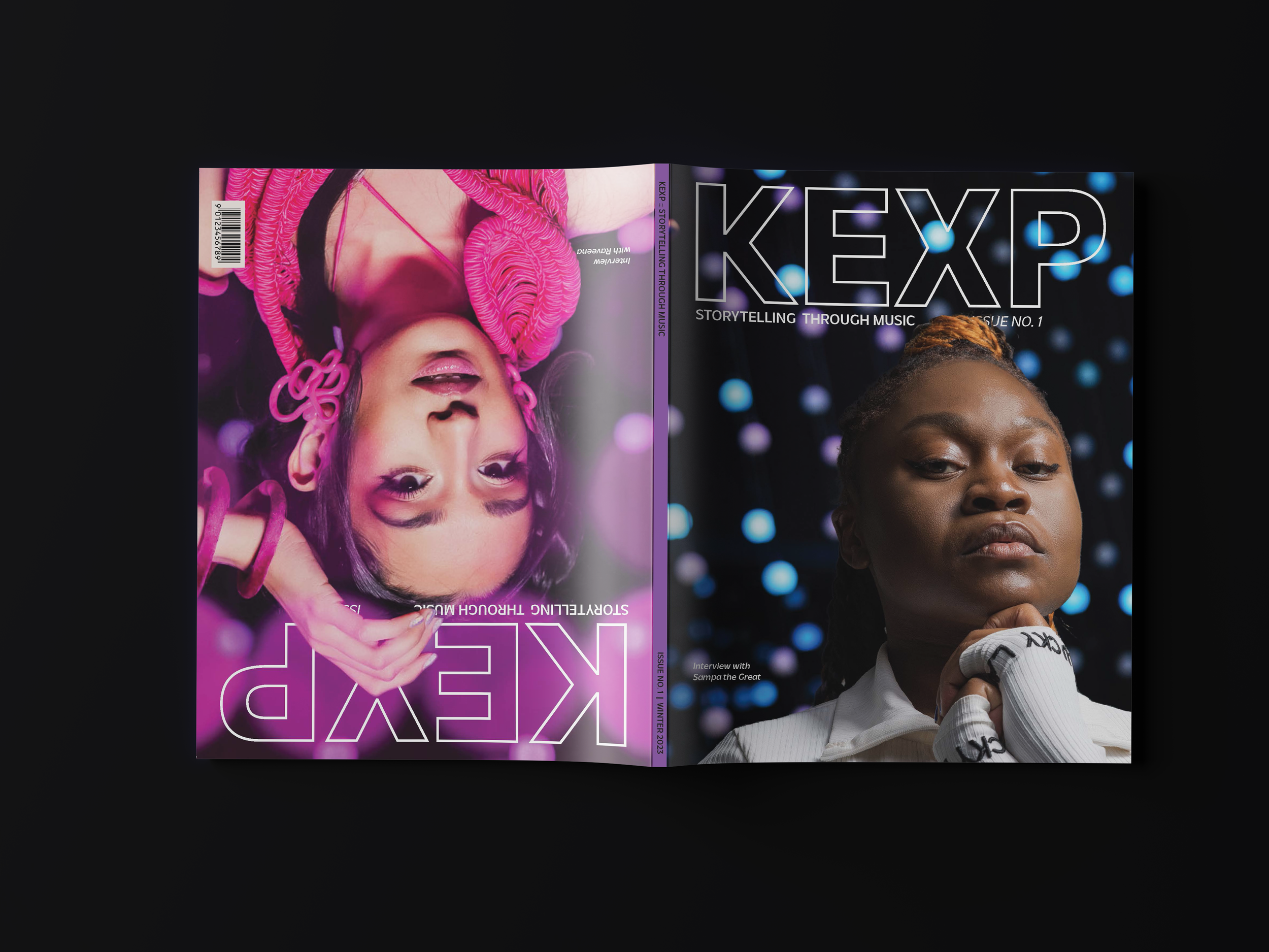
Kexp Magazine
Layout, branding, art direction, print, typography

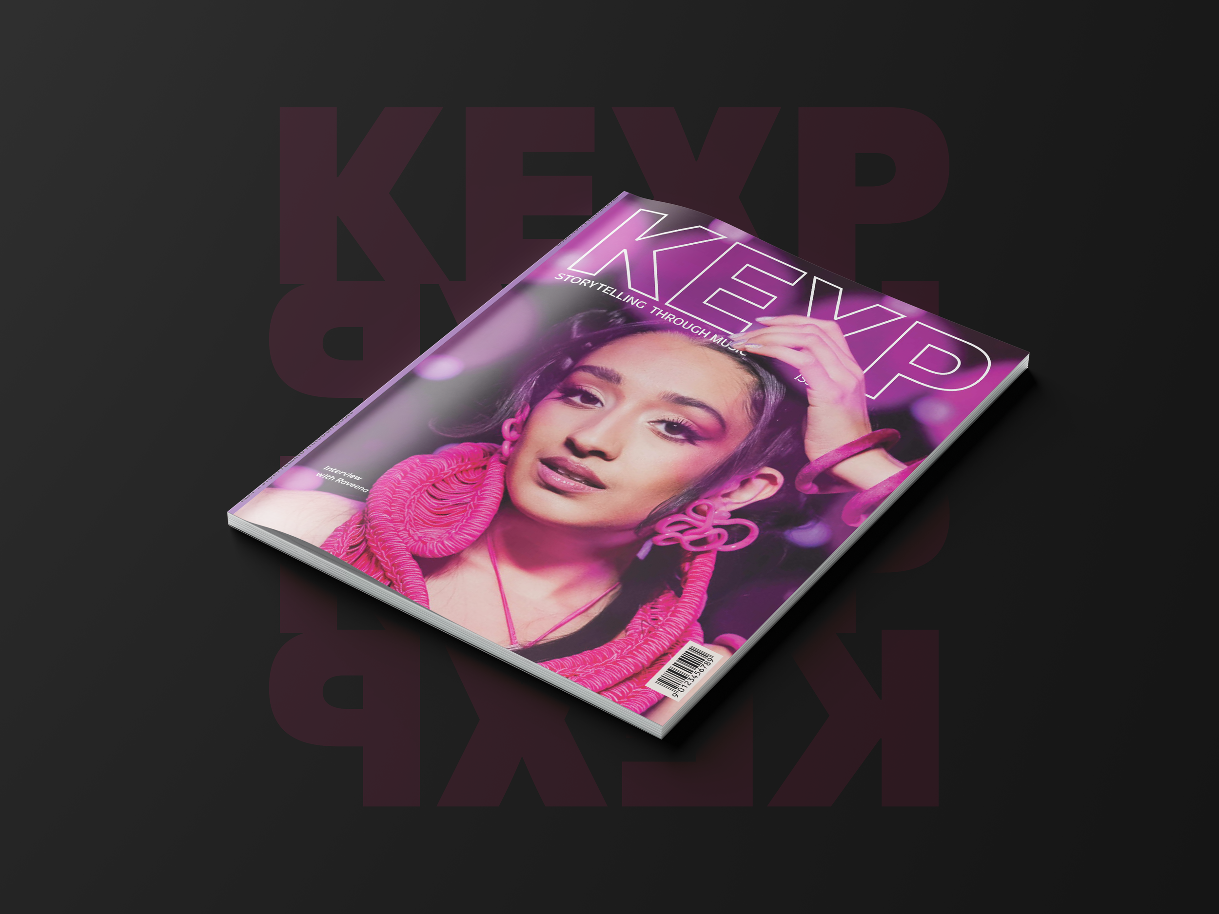
Overview: The goal of this project was to create a magazine for KEXP. KEXP is “an international community of music lovers and music makers, and a nonprofit organization fostering relationship and community building through broadcast, online, and in-person music experiences.”
Challenge: How do I highlight the incredible talent of the KEXP photographers and editorial team with my layout and design choices? Additionally, how do I visually express the core identity and mission of KEXP while simultaneously positioning KEXP as a leader in the music industry?
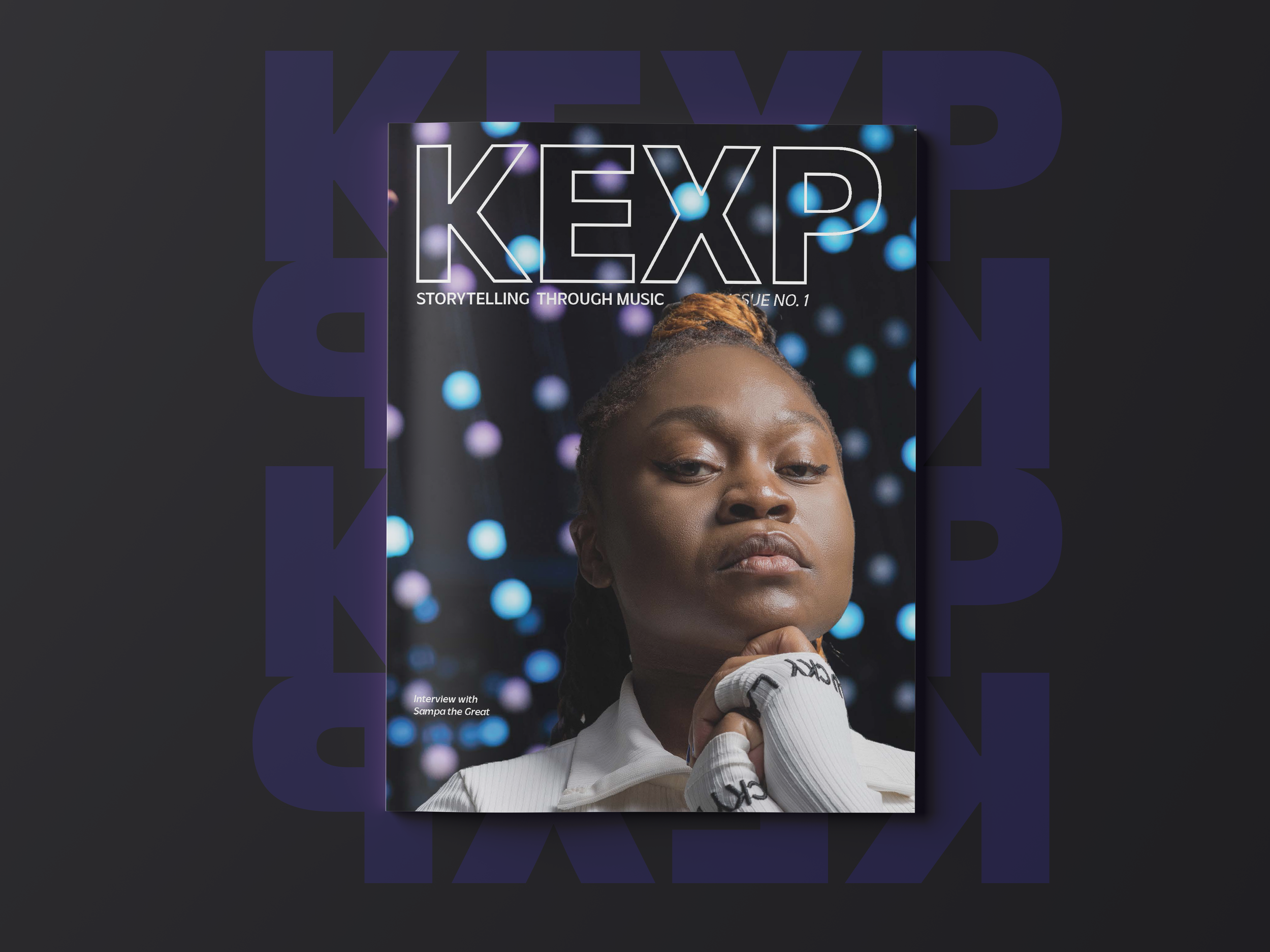
Solution: When developing the KEXP Magazine, I made sure that I communicated visually the organization's and its staff's professionalism, the engaging and talented artists played on the radio airwaves, and the fun vibrant nature of their in-studio performances. I achieved this through the concept KEXP: Storytelling Through Music. This theme embodies how KEXP DJ’s curate their sets, the nature of KEXP in-studio performances and interviews, and emulates the astute tone and style of the editorial and photography team.
Solo project
Deliverable
Flip through Side A
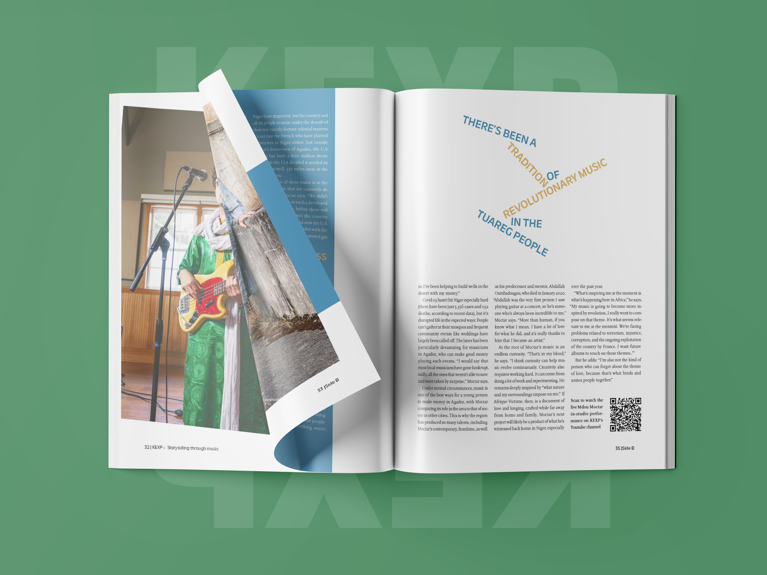
Designed to resemble the tactile sensation of flipping a record or tape.Flip through Side B
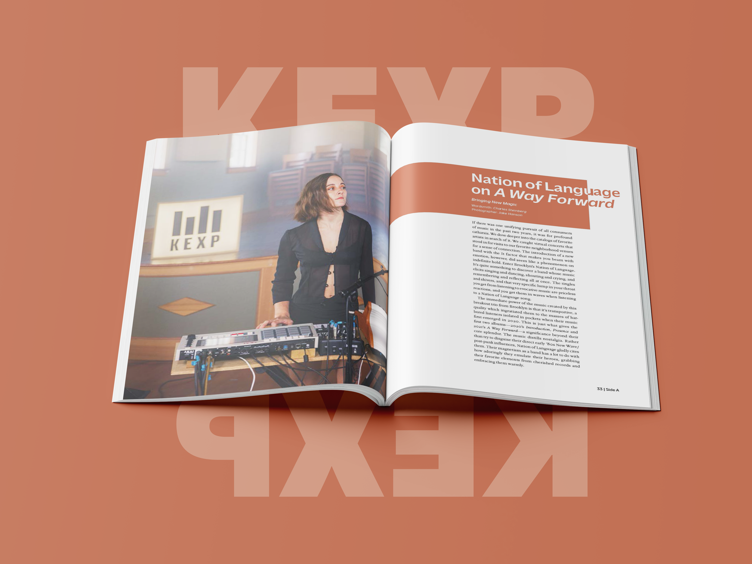
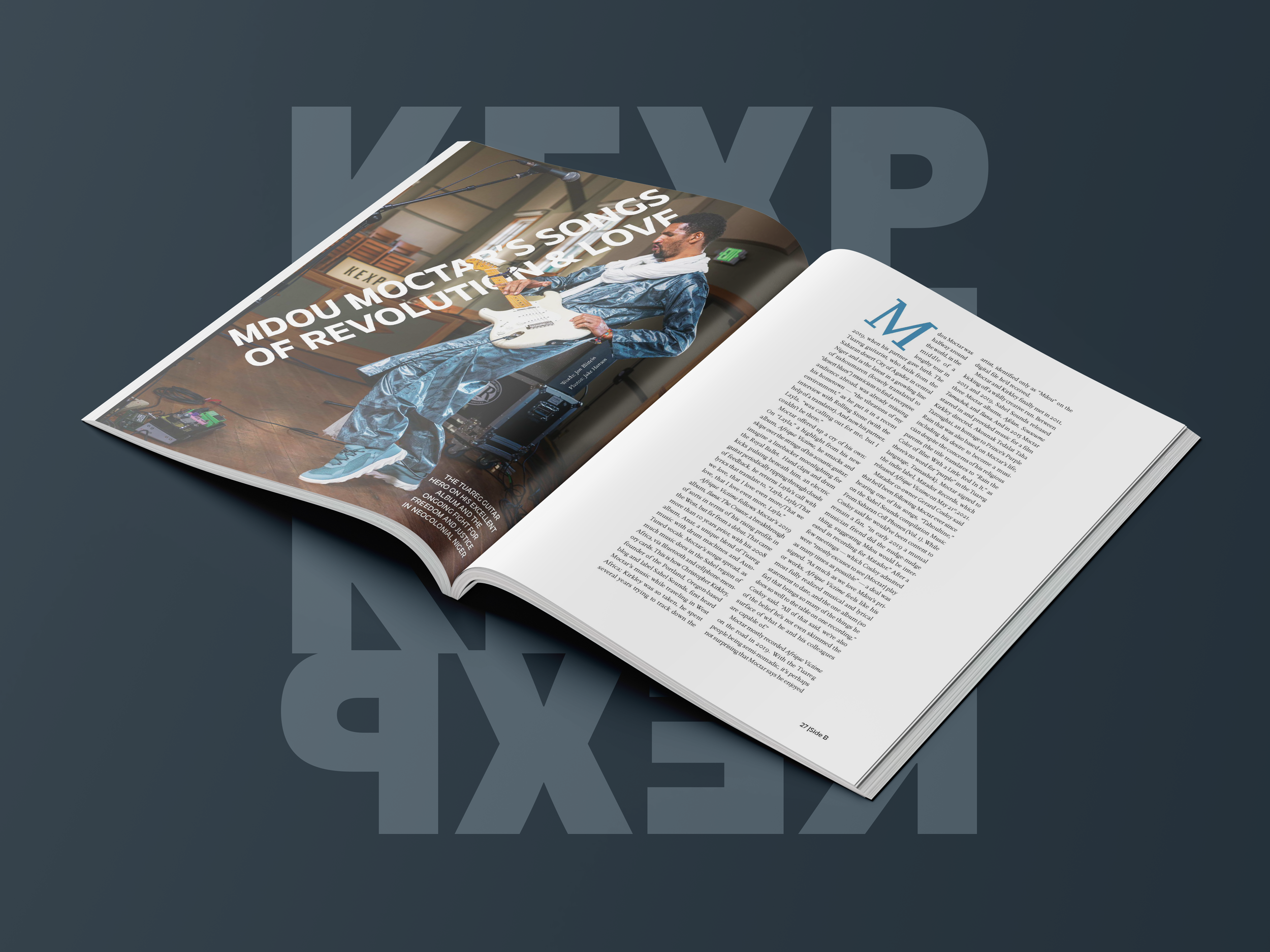
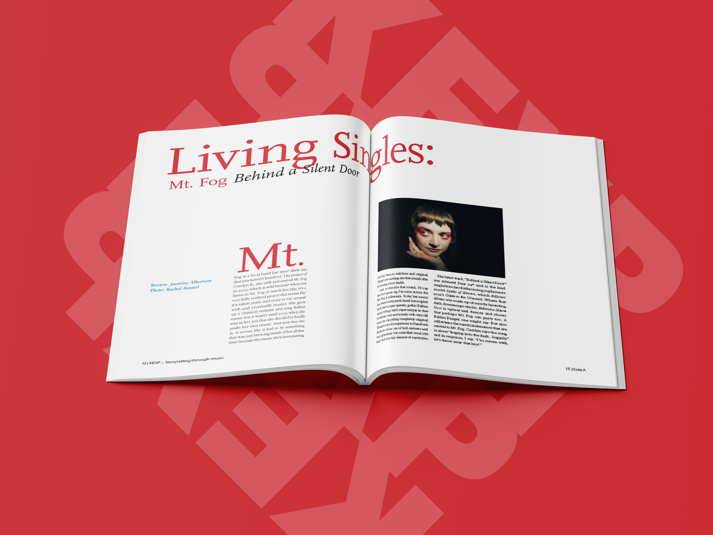
Select Spreads
Process
Personas
KEXP is a global community of music lovers rooted in Seattle. The common thread amongst this demographic is their love of music: spanning across different eras, styles & traditions. This magazine does not specifically target one generation or gender identity. Instead, it aims to appeal to the current KEXP audience who share common characteristics like: championing new artists, being engaged with the community, and sharing an adoration for music discovery. This demographic actively strives to be inclusive, diverse, and equitable. The KEXP magazine is an extension of this spirit and embodies theses aforementioned qualities.
-
Age: 57
Generation: Gen X
Pronouns: he/him
Occupation: Record Store Owner
Location: West Seattle
Draw to music: Tim is an avid concert goer, record collector, and listens to the radio all the time. He was in a band in his 20’s and saw Nirvana and Bikini Kill on the same bill back in the 90’s and likes to bring it up.
Story: Tim has three cats. He loves collecting books and records. On the weekends he enjoys travelling to the beautiful PNW Islands with his partner to visit different vintage shops. He exclusively listens to radio on KEXP and would sell the KEXP magazine at his record store in a heart beat.
-
Age: 31
Generation: Millenial
Pronouns: she/her
Occupation: Epidemiologist
Location: Splits time between New York & London
Draw to music: Her favorite artists are Bjork, St.Vincent and Prince. She enjoys listening to KEXP when she’s cooking dinner. She also likes to stream the KEXP archives for variety mix shows like Pacific Notions, Street Sounds and Overnight Afrobeats.
Story: Angela is fashion obsessed and also very studious. She loves going to the cinema at tiny theatres and taking the train to Staten Island when she’s living in New York. When she stays at her flat in London she prefers shopping, karaoke with her friends and getting pedicures.
-
Age: 44
Generation: Gen X
Pronouns: he/him
Occupation: Microsoft Engineer
Location: Renton
Draw to music: He likes to listen to the radio when he’s driving around town. He just found out about the KEXP Youtube channel and enjoys watching the in-studio performances before bed with his kids. He also enjoys going to shows at the Climate Pledge Arena.
Story: Kyle is happily married with two kids. He loves to take his kids to the park with the family dog. His favorite pastimes include visiting breweries in Ballard, going on hikes in the beautiful PNW and attending his children’s soccer games.
-
Age: 22
Generation: Gen Z
Pronouns: they/she
Occupation: Student and barista
Location: Buenos Aries
Draw to music: Alathia is an aspiring drummer. They fell in love with Kate Bush after watching Stranger Things. They also love 90’s rock bands and synth pioneers like Suzanne Ciani.
Story: They discovered KEXP when they did their remote broadcast in Argentina. They were in attendance at the Las Ex show. They now tune into El Sonido on their Android when they think of it.
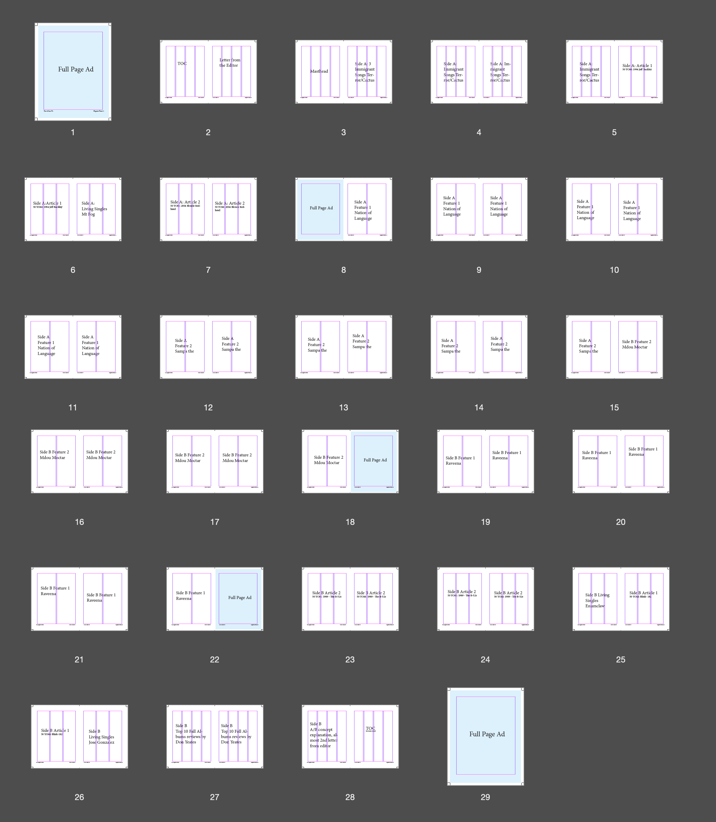
Moodboard & Flatplan

Color
The initial color palette I came up with for the magazine mimicked the most common light colors used during KEXP in-studio performances. As the process evolved, I added colors that pulled from elements that artists were wearing, like the color of their clothes, hair, or make-up.
Typography
The display text Massilia is a strong but friendly sans-serif, similar to the current KEXP logo typeface. The body text, Scala Pro, is stylish and legible. Legibility is determined from its tall x-height, so that each letter has more open counter space, thus making it easier to determine each distinct letterform. Scala Pro also has thick and thin strokes in each letterform, making it a dynamic font, just like the organization it represents.
Ensuring Consistency
At every turn, I returned to the adjectives: fun, engaging, and professional to vet all design decisions and to honor the existing identity of KEXP.

Art Direction: Photography

The images I used as inspiration for my magazine.

Different layouts and type treatments I wished to incorporate into the magazine

Early exploration of different drop caps, column structures and header, subhead, body text lock ups.
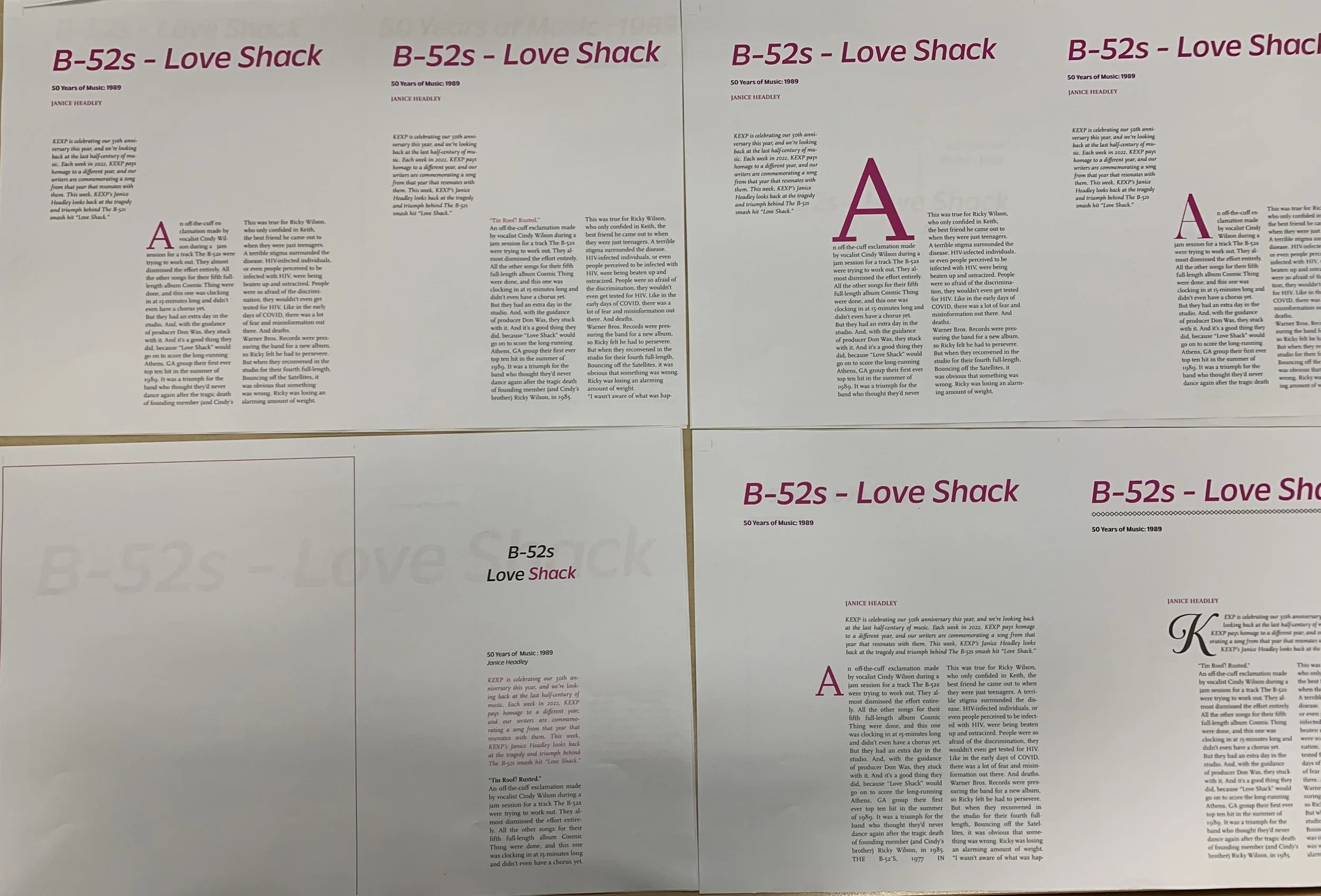
Further stylization exploration.

First iteration of the first article I designed.
Final Insights

Creating the KEXP magazine was an incredible opportunity for me to thread together my love of music and design. As a DJ at KEXP and a graphic designer, it was an honor to marry these devotions together through content curation and layout design. One day, I would love to see this project through to actualization via print and distribution!